Now that we’re done sobbing let’s see how you can create eye kicking banners for your online store and give your conversion rates a kick in the butt.
The main problem with banners is Banner Blindness. It is a well-researched phenomena. When customers are focused on searching something they just don’t “See” the banners. They just ignore them so nothing will divert them from their current online activity. To beat this blindness you need to ensure your banners follow a few simple rules:

A banner from Celebros customer, RoadRunnerSports.com
1. As always, less is more. Keep your blurb to a focused relevant minimum and use BIG cool fonts.
2. For your clickable banners — always add a call to action button. Don’t let them guess it’s clickable.
3. Movement is an attention grabber. It’s a primal thing we are conditioned to from the time we had to fear any unexpected movement, so if possible, create html5 banners for your key pages.
4. Keep it light. Your banner should load real fast. Keep to a 10k- 15k minimum. Slow banner upload is a guaranteed customer pisser.
5. When you create a clickable banner make sure the follow through is accurate. If you send them to a landing page ensure the message and style match the banner. If it’s a search results page make sure to add an image banner on top that will supply the contextual relevancy for customers.
6. Refresh your banners to avoid banner burnout. If you lack the resources to change all of them, at least change the main ones.
7. Use a search solution that enables you to work with all types of banners (clickable, non-clickable, flash/image banners). By enabling you to tie a banner to specific searches you will achieve best relevancy and therefore effectiveness.
8. Avoid auto-rotating banners. Customers absolutely hate those since they can’t control the speed of rotation and more often than not can’t manage to absorb the message before it rotates. Website designers love them because they enable them to push a lot of information into a prime onsite real-estate spot. A good compromise will be either a banner where all ad options are presented is small tabs on the side so the user can click which eve one he wishes to see the full message, or just a pagination option customers can click to move to the next banner.
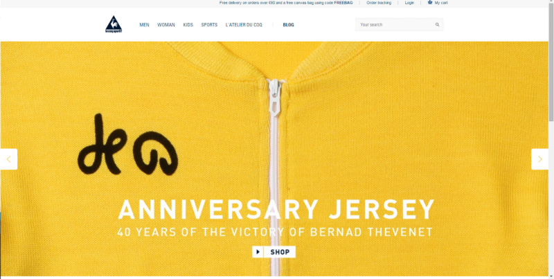
9. A Hero Banner is all the rage. All the leading brands use it, and personally I think it looks great –if done properly. If you are not familiar with the concept: a Hero Banner is a page size image that contains a key message and a call to action.

Here’s one of my favorite from leCoqSportif.com:
It’s eye catching, usually created with amazing images, and just the novelty of it is an effectiveness booster all by itself. These types of banners are great for getting your key message out, making important announcements (new brand you carry, sale, etc.), and they look amazing on mobile phones.
Celebros provides a dynamic merchandising tool that allows merchants to create, deliver, monitor and analyze campaigns across the site. The dynamic merchandising tool also allows merchants to create campaigns that directly target search terms that were used by past searchers based on their individual analytics.


